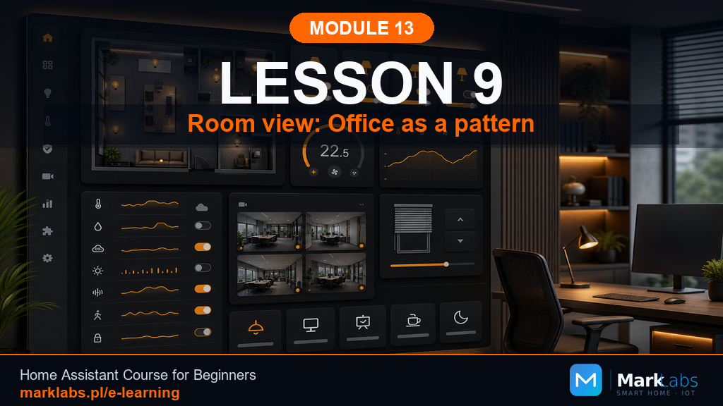
The Office View: A Pattern for Every Room
Start gave the whole house a fast overview, this lesson goes deep on a single room, the Office, building a pattern you can genuinely copy for every other room in your own home, hallway, bedroom, kitchen, without reinventing the structure each time.
Start versus Office: two genuinely different goals
Start answers "what's the state of the whole house," Office answers "what's happening in this one specific room, and what can I do about it." Where Start deliberately stayed shallow and capped at eight cards, Office genuinely goes as deep as this one room actually needs, every light, the temperature, the scene, the automation status, all in one dedicated place.
The Climate section
A Climate section genuinely groups a gauge for sensor.office_temperature, a tile for input_number.office_temp_threshold, and the 24-hour history chart from Lesson 7, everything related to the room's comfort in one visually grouped block. Grouping by genuine concept rather than by raw entity type, comfort together, lighting together, scenes together, is exactly what makes a room view considerably easier to scan quickly than a flat, undifferentiated list ever could be.
The Control section
A Control section genuinely holds tiles for switch.led_status_biuro and any other switchable device physically in the office, the room's direct, everyday, hands-on controls. This is deliberately the section a household member reaches for most often, and it genuinely deserves the most prominent, easiest-to-tap placement on the whole view.
The Scenes section
A Scenes section genuinely holds a button for scene.movie_night and any other saved office-relevant scene, kept visually separate from ordinary switches because activating a scene changes several things at once, a genuinely different kind of action than flipping one single switch.
A light diagnostic section, deliberately minimal
Office genuinely earns one small, light diagnostic touch, a single tile showing whether test_mode_hallway or its office equivalent is active, warning a household member not to be confused by unusual behavior during testing. This is entirely deliberate and minimal by design, the full diagnostic detail genuinely belongs on the dedicated diagnostic view this module rebuilds quite soon, not duplicated here on Office at all.
What genuinely not to give a household member here
Raw automation YAML, entity_ids, or ESPHome diagnostic sensors genuinely have no place on Office, they belong on Admin or the technical dashboard this module still has to build. A household member using Office should genuinely never need to understand how anything actually works internally, only what it does and precisely how to control it directly, right there on the screen in front of them.
Step by step: building the Office view
Create a new Sections view named Office. Add a Climate section with the gauge, threshold tile, and chart, a Control section with the LED tile, a Scenes section with the movie-night button, and a small diagnostic tile at the bottom. Save, then genuinely read through it carefully top to bottom as if you were a household member seeing it for the very first time.
A YAML example: the full Office view
title: Office
type: sections
sections:
  - type: grid
    cards:
      - type: gauge
        entity: sensor.office_temperature
      - type: tile
        entity: input_number.office_temp_threshold
      - type: history-graph
        entities:
          - entity: sensor.office_temperature
  - type: grid
    cards:
      - type: tile
        entity: switch.led_status_biuro
      - type: button
        entity: scene.movie_night
A card-classification table for Office
A simple table genuinely helps before building any room view, entity, section, card type, for every single item, temperature to Climate as a gauge, threshold to Climate as a tile, LED to Control as a tile, scene to Scenes as a button, test-mode flag to a small diagnostic tile. Filling this table in carefully before opening the dashboard editor genuinely turns Office's entire construction from vague guesswork into a straightforward, repeatable checklist.
What can genuinely go wrong on a room view
A room view can genuinely balloon into a duplicate of the diagnostic dashboard if every helper and timer gets added "just in case." Sections can blur together if entities aren't grouped by genuine purpose. And a room view built for one room can quietly drift out of sync if a new device gets added to that room but never gets added to its view.
An exercise: build your own room view using this pattern
Pick a second room in your own home, the hallway is a natural choice given this course's running examples, and build its view using the exact same Climate, Control, Scenes, light-diagnostic structure just applied to Office. Reusing one genuinely proven pattern across every room is considerably faster, and considerably more consistent, than carefully designing each and every room's view completely from a blank page each time.
Section order within Office, and why it matters
Placing Climate above Control is a genuinely deliberate choice, comfort is passive information a household member checks first, while Control is the section they actually act on, and putting the passive read-only information first genuinely lets someone glance at the room's overall state before deciding whether any action is even actually needed at all right now. Reversing this order, controls first, comfort readings buried below, would genuinely work too, but consistency across every room view matters considerably more than which specific order you personally prefer.
Naming sections clearly, not just cards
Lesson 6 covered naming individual entities carefully, and that same discipline genuinely extends to section headers themselves, "Climate" and "Control" read considerably more clearly than generic defaults like "Group 1" and "Group 2." A Sections view genuinely supports a clear heading per section, and skipping that heading entirely is one of the single easiest ways an otherwise well-organized room view still ends up feeling unlabeled and genuinely slightly confusing to actually use every day.
Why Office genuinely doesn't need an eight-card limit
Start's eight-card ceiling exists specifically because it represents the entire house all at once, Office genuinely represents just one single room, so a slightly larger card count, ten or twelve spread across several genuinely distinct sections, remains perfectly reasonable as long as every single card still traces back to something a household member would actually want to see or control while genuinely standing right there in that specific room.
A real-life example: adjusting the threshold from Office directly
Picture a household member noticing the office feels a touch too warm, opening the Office view, seeing the gauge sitting near the top of its range, and adjusting input_number.office_temp_threshold directly from the very same Climate section without ever needing to open the automations editor or understand how the underlying threshold automation actually works. This is precisely the genuine payoff Module 12's careful helper-based design was building toward all along, and Office is exactly where that payoff genuinely becomes visible, tangible, and usable in ordinary daily life.
Extending this pattern to rooms with more devices
A room with considerably more devices than the Office example here, a living room with several lights, a media player, and a thermostat, genuinely just means more cards within the same Climate, Control, Scenes structure, not a fundamentally different pattern. The section names might expand slightly, a Media section alongside Climate and Control, but the underlying discipline, group by genuine purpose, keep diagnostic detail firmly elsewhere, stays exactly the same regardless of the room's actual size or overall device count, no matter how large the house eventually grows.
Office as a genuine second data point on your dashboards
Having now built both Start and Office, you genuinely have two real data points for comparison, a whole-house overview capped tightly at eight cards, and a single-room deep-dive with considerably more breathing room. Noticing how genuinely differently these two views actually feel to use day to day, one fast and glanceable, one detailed and deliberate, is exactly the kind of practical, transferable intuition this module is trying to carefully build well beyond just these two specific example views alone.
Where the icon and naming lesson pays off directly here
Lesson 6's naming and icon housekeeping genuinely shows its value most clearly on a view exactly like Office, a switch tile reading "Office LED" with a specific light-bulb icon, rather than a raw entity_id and a generic default glyph, is precisely the difference between a room view a household member trusts at a glance and one that quietly requires a moment of extra thought every single time it's used.
Deciding what counts as "this room" versus "adjacent"
A genuinely tricky judgment call in any room view is deciding what physically counts as part of that room, does a hallway sensor just outside the office door belong here or on the hallway's own view. The general rule this course genuinely recommends is area assignment as the single deciding factor, whatever Lesson 6 assigned to the Office area genuinely belongs on Office, whatever was assigned elsewhere genuinely belongs on that other room's own view instead, keeping the decision consistent and cleanly traceable rather than a matter of ad hoc, case-by-case guessing every single time.
Office and the diagnostic view: a genuinely clean handoff
The single small diagnostic tile on Office genuinely exists as a signpost, not a destination, its entire purpose is telling a household member "something unusual might be happening, tap through for the full picture" rather than trying to explain that full picture inline. This clean, deliberate handoff between a light touch on Office and full, genuine detail on the dedicated diagnostic view, rebuilt properly in the very next lesson, is exactly the kind of layered structure this entire module has been carefully building toward from its very first lesson onward.
Testing Office the same way you tested Start
Just as the previous lesson recommended handing Start to an untrained household member, Office genuinely deserves the same honest test, watch someone actually use it for a few days, adjusting the temperature, triggering movie night, and see whether the Climate, Control, and Scenes grouping genuinely matches how they actually think about the room in practice, or whether it needs rearranging based on real observed behavior rather than simply the pattern as originally designed on paper.
A closing thought: Office as this module's real proof of concept
Office is genuinely the first view in this entire module where every single earlier lesson visibly comes together at once, card types chosen deliberately, names and icons cleaned up in advance, charts used only where they genuinely earn their place, and a layout organized by real purpose rather than by convenience. If Office genuinely feels calm, readable, and truly useful once it's finished, that's concrete, tangible proof this module's discipline actually works well in daily practice, not merely as an abstract theory on a page.
Key takeaways
Office goes deep on one room, Start stays shallow across the whole house, the two never overlap.
Group entities by purpose, Climate, Control, Scenes, not by raw entity type.
A light diagnostic touch is fine, full diagnostic detail belongs on its own dedicated view.
This Climate/Control/Scenes pattern reuses cleanly for every other room in the house.
What's next
With a proven room-view pattern in hand, the next lesson returns to Module 12's diagnostic dashboard, rebuilding it properly with everything this module has taught about names, cards, and organization.